ZEISS Design System.
A design system and navigation concept for the entire range of ZEISS business unit websites.
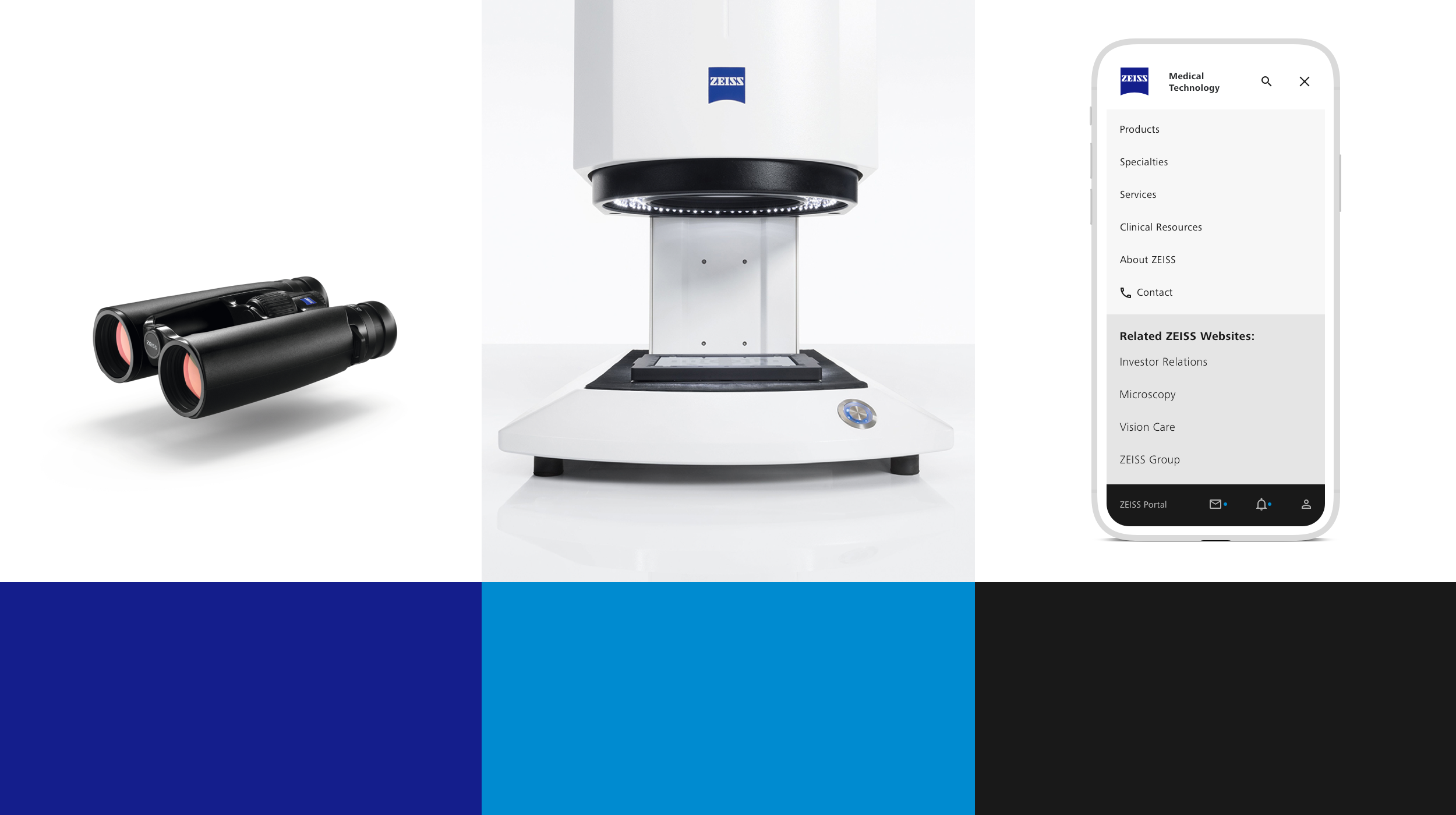
Create a consistent and cohesive User Experience across multiple ZEISS business units.
CHALLENGE
With so many varied types of business units, ZEISS needed an overarching navigation structure that could be applied to the entire organization.
Tasked with enhancing the User Experience across these diverse business units, I began a collaborative process with the in-house Medical Technology team at Carl Zeiss AG in Munich, Germany.
The goal was to create a unified framework that could seamlessly integrate across the spectrum of ZEISS's offerings, ensuring consistency and clarity for users navigating through the brand's expansive digital landscape.
Creative Lead Digital
Creative Direction, UI/UX Design, Visual Design, Prototyping, Client liaison & workshops, On-site collaboration with development team
Client
Carl Zeiss AG, Munich, Germany


SOLUTION
A design system and navigation concept for the entire range of ZEISS business unit websites.
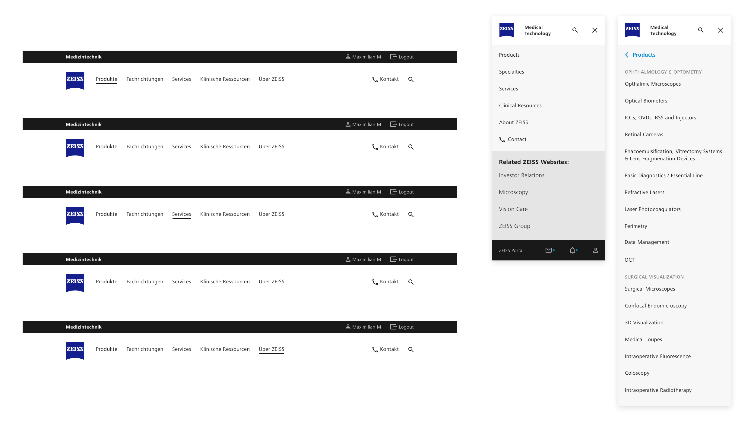
Kicking off the project with an initial briefing and workshop at the Oberkochen headquarters of ZEISS, I partnered with an expert UX Designer and Information Architect, and we embarked on the challenging task of redefining the international website's entire structure.
Our aim was to make the user experience more intuitive, cohesive, and user-friendly whilst taking into account the requirements of each business unit.
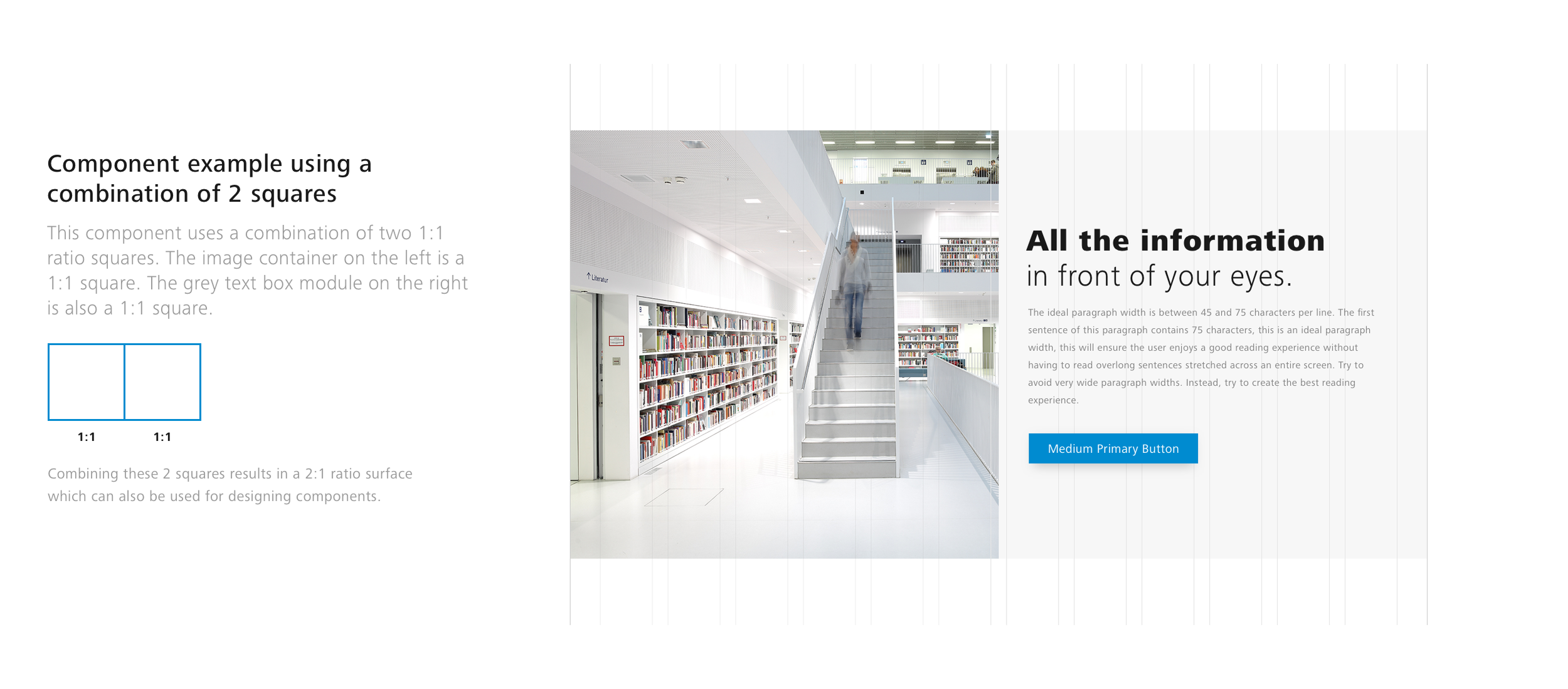
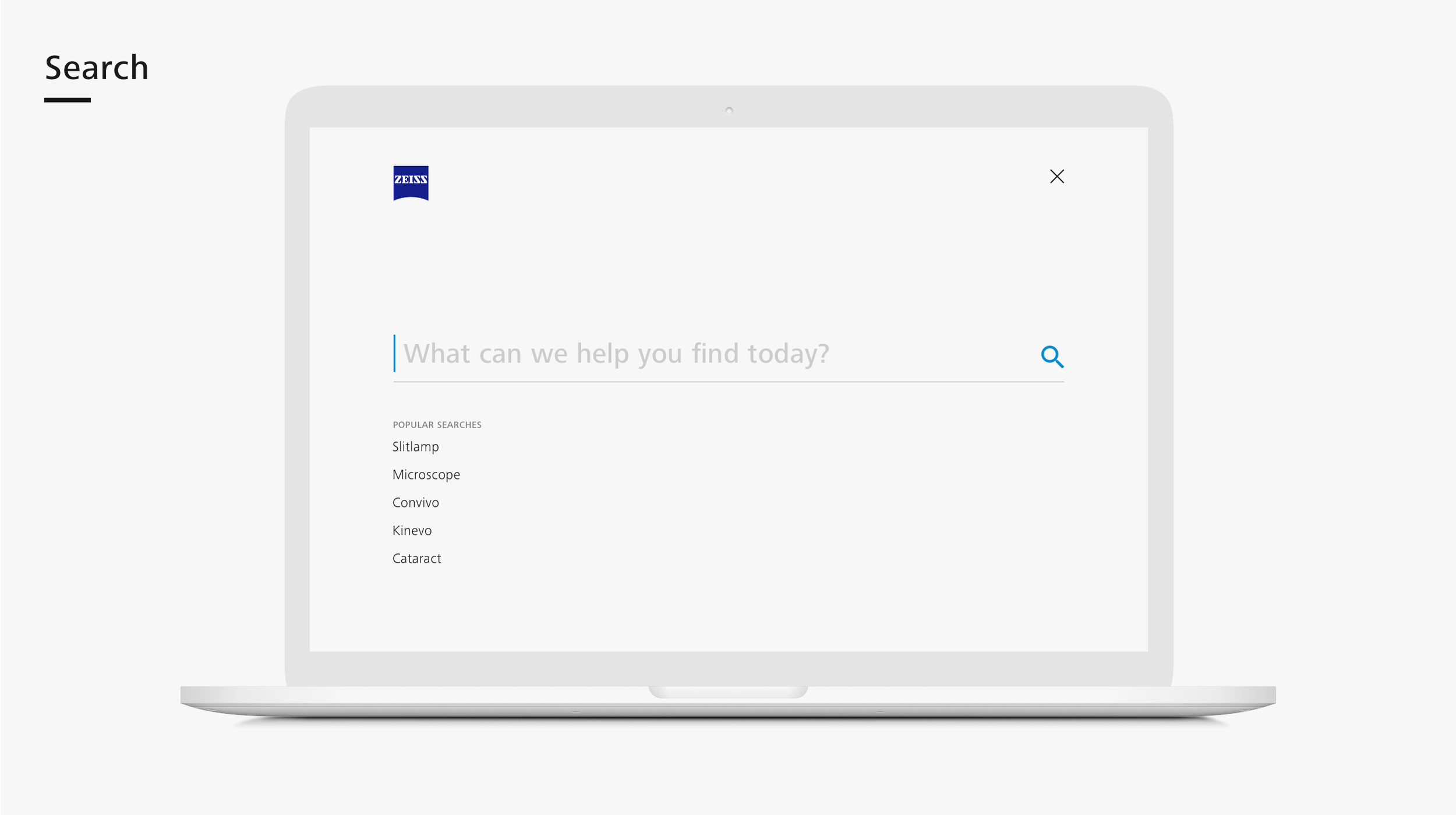
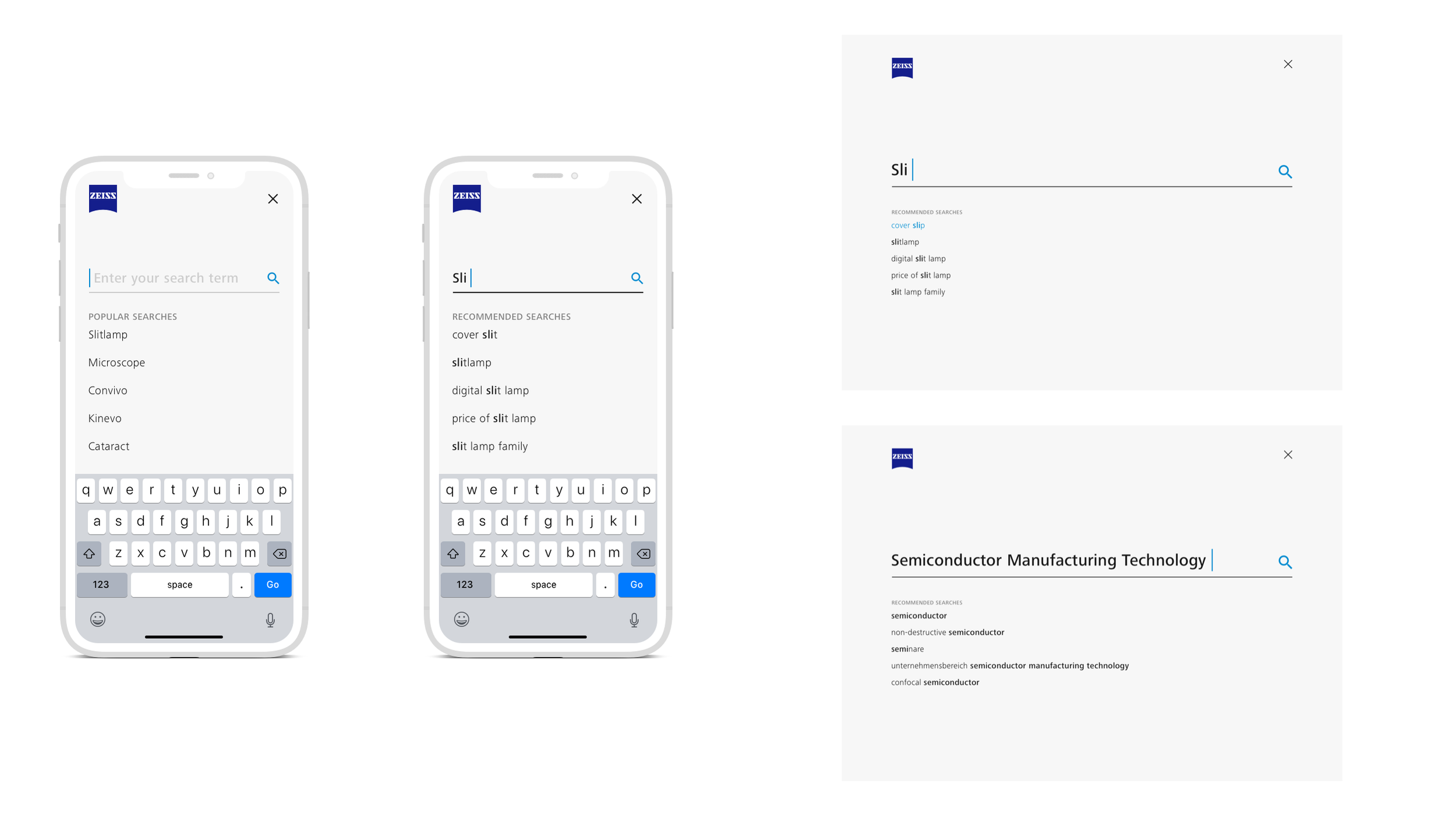
I then crafted a responsive visual design system and user interface that would be universally applicable throughout the entire range of ZEISS websites.
This required not only creativity but also meticulous attention to detail, as I had to ensure that the design elements not only looked aesthetically pleasing but also reflected the look and feel of the brand and the physical ZEISS products.


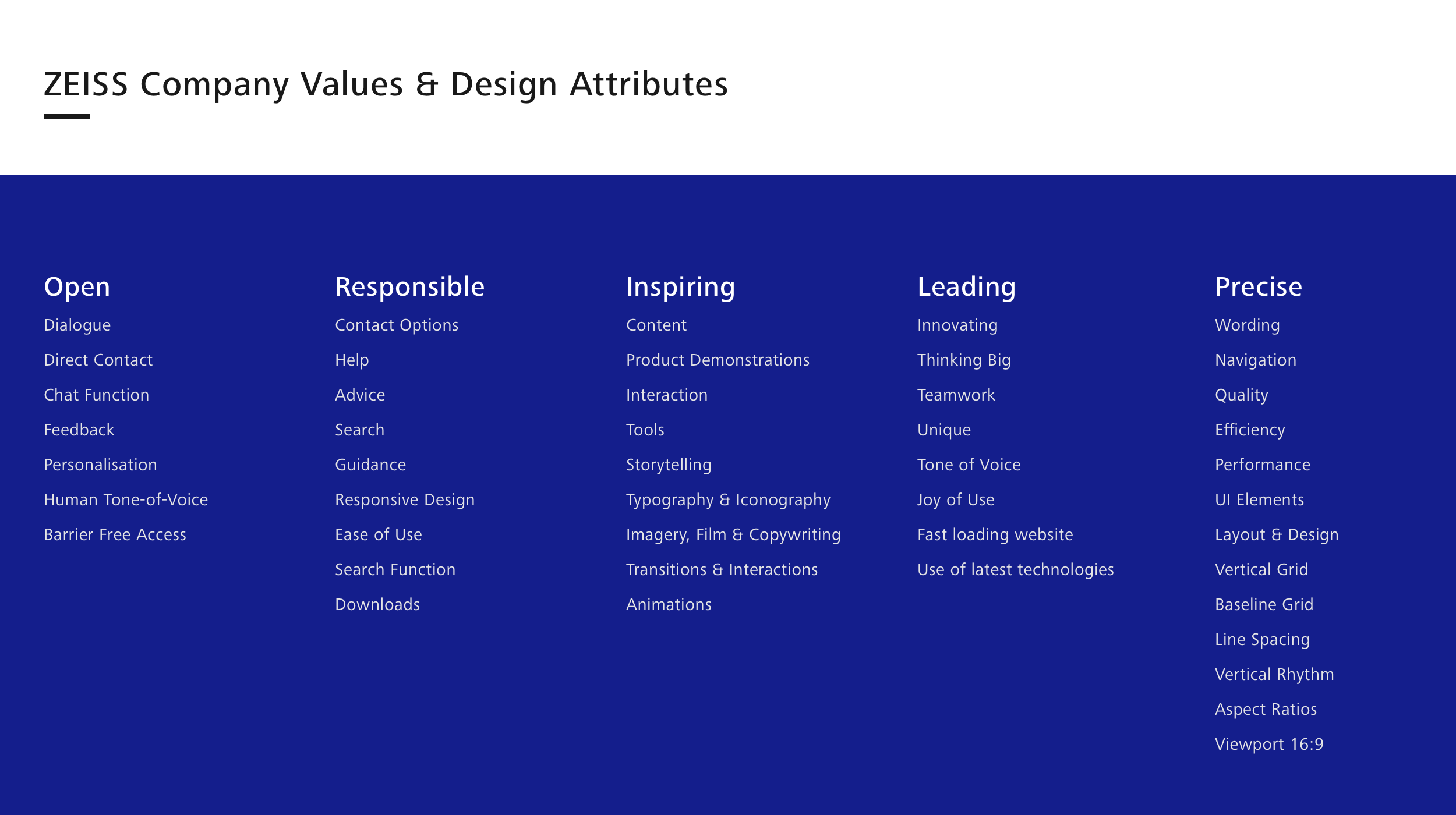

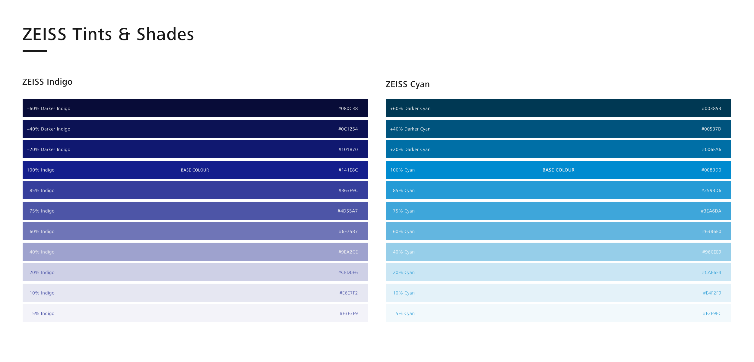


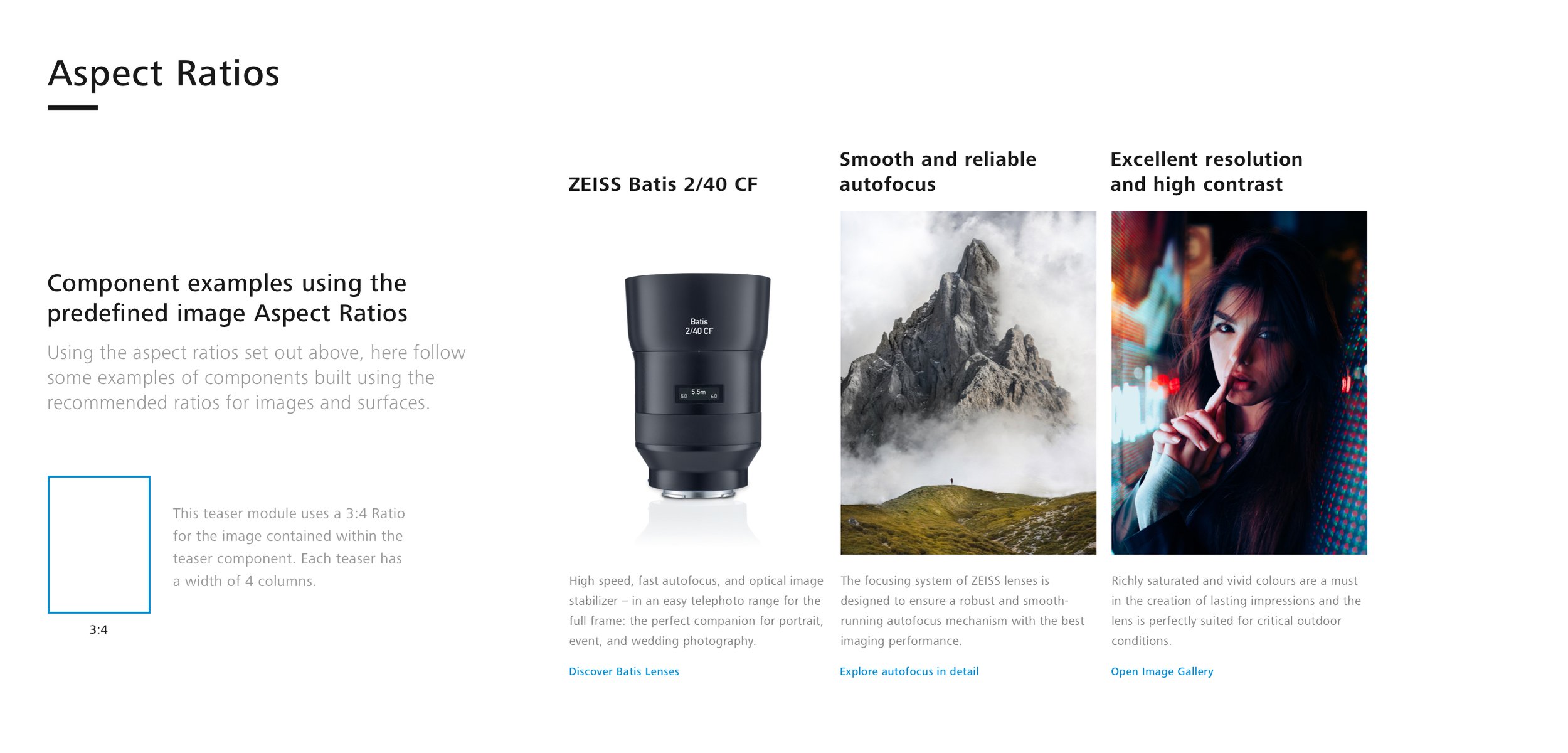


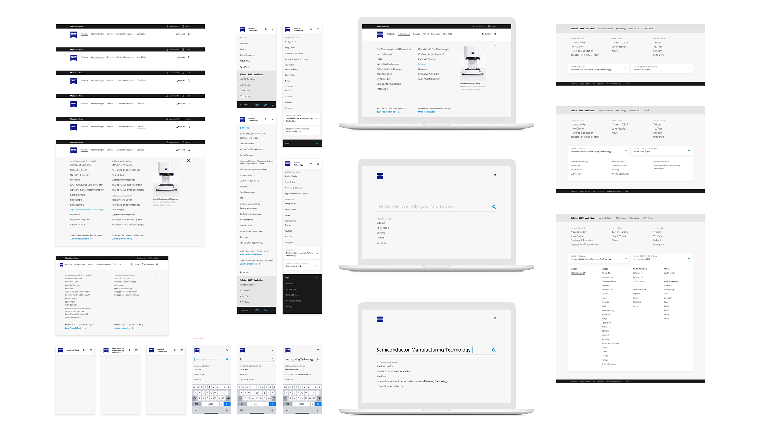
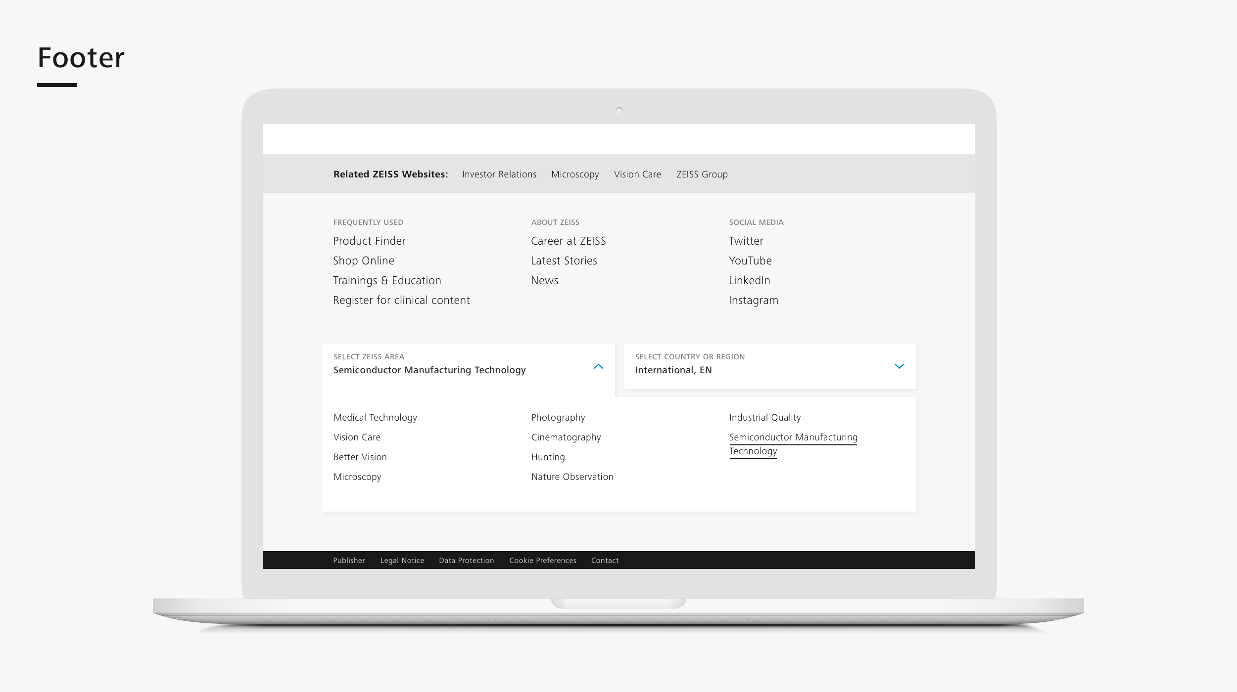
Project Insights.
Some detailed insights into the thinking, concept, and experience of creating the ZEISS Design System.
The Outcome.
The result of this collaboration with ZEISS was a visually captivating and highly functional branded design system that has successfully been integrated into the entire spectrum of ZEISS business unit websites.
This system has not only improved the overall user experience but also solidified the ZEISS brand as a leader in delivering cutting-edge medical technology solutions.
My role also extended beyond the visual design work to include providing guidance to in-house team members and collaborating closely with developers to ensure the successful implementation of the design system and navigation.
Workshops.
To keep all team members and stakeholders up-to-date, we organized a series of interactive workshops. These meetups served as a platform to showcase the progress of the design system and were a great way of getting to know the development team.
During these sessions, we presented prototypes and interactive mock-ups to illustrate how the system would function and look in a real-world context. This allowed for early feedback and adjustments, whilst fostering a sense of ownership and enthusiasm among team members.
It was a lot of fun too, and proved to be fundamental in creating a good working relationship amongst the team members.
Collaboration.
To bring the design system and navigation concept to life, close cooperation with the developers was essential.
Throughout the project I actively engaged with the development team, discussing the technical feasibility of design decisions, and addressing any potential challenges that would arise.
This collaborative approach was instrumental in ensuring that the final product would be both visually appealing and technically robust.
Acknowledgements:
Many thanks go to the great MediTec team at ZEISS for the productive collaboration.

